Get things done the easy way! Access this service smoothly on the AiOiA app. Download now and
enjoy hassle-free bookings!


Most apps look good on the surface. Nice colors. Smooth layout. Big buttons that say “Book Now.”
But after a few uses, things start to wear thin. You try to reschedule something, and the app won’t let you. You want to rebook the same service from last time, no shortcut. It doesn’t remember your preferences, and might not even ask.
Feels like starting from scratch every time.
So what does it result in? Uninstall the app & move on to another option. Find something that respects their time.
Here’s what most apps miss: users don’t care about your roadmap. They care about what makes their day smoother. Fast booking. Saved settings. Clear options. That’s it.
The problem isn’t a lack of service mobile app features. It’s a lack of thought.
This blog pulls together the most overlooked features in service apps, the ones that rarely get mentioned in pitch decks, but quietly win over real users. Especially for booking apps and mobile service platforms, these small details make all the difference.
So let’s stop guessing and take a look at what actually works.
When we are discussing the overlooked mobile app features, it is important to understand what these apps think before we proceed ahead.
You can also check out such an approach in real time. An app packed with features. Tutorials. Tooltips. Buttons everywhere. Half of it, you’ll never touch. The rest? Hidden under menus that make no sense.
Most service apps are built from the top down. Someone decides what “should” be in the app, then forces users to work around it. The result? Features people don’t need, and missing the ones they do.
Here’s what usually gets prioritized:
A loyalty program that’s buried in the fifth tab
A fancy calendar view no one knows how to use
Complex filters that confuse more than they help
And here’s what often gets skipped:
Remembering your last booking
Saving special instructions automatically
Giving users a way to rebook in under 10 seconds
Apps love showing off big features. But users remember the small ones.
If your app isn’t doing the basics, fast load, easy booking, simple edits, nothing else matters. It doesn’t matter how beautiful your UI is if people can’t get through a task without frustration.
That’s the gap.
You don’t need to guess what users want. Just watch what they repeat or evaluate their actions. What they pause on. What they try to do but can’t. That’s your feature list. Not the wishlist your product team brainstormed last quarter.
In service apps, mobile app features don’t win because they’re impressive. They win because they’re practical and actually useful. Quiet. Useful. Fast.
Now let’s talk about the ones everyone forgets, but users never stop wanting.
Some apps do it all. Except for the thing users really need.
Let’s consider these scenarios:
You're attempting to book the same cleaner as last month. No bypass.
You need to add a quick message: “Don't ring the doorbell, baby is sleeping.” No choice.
You cancel an appointment, but now you can't rebook without filling out the whole form again.
Frustrating! They're not huge issues. They're minor ones. But with too many such minor issues? People drop your app.
These are the features most apps omit, but users miss when they're no longer there. So let’s focus on some of the most overlooked features in a service app.
You just want to book a car wash. Nothing fancy. Two minutes, in and out.
You open the app and get hit with:
“Please create an account to continue.”
That’s it. You’re out.
This happens more often than most apps care to admit. And it’s a quick way to lose new users. People don’t want to register just to look around. They want to browse, check availability, maybe even book, and then decide if it’s worth signing up.
Guest Mode fixes this. It lets people explore and book without logging in. No account. No password. Just straight to what they need.
And here’s the truth: if their first experience is smooth, they’re more likely to create an account later. You earn trust by removing friction, not by forcing forms.
This is one of those overlooked service app tools that quietly boosts retention. It removes the most common exit point for first-time users and sets a tone of ease from the start.
Where it fits:
Right on the login screen. Add a simple “Continue as Guest” option. Then, once they complete a booking, offer to save their info for next time. No pressure.
It’s one of the best features for service apps, and one of the least implemented. Build it and you can experience the difference.
Let’s say you book a cleaning service today.
Next month, you want the same thing. Same team, same time, same notes.
But as you open the app, you have to start all over again. Pick the service. Set the time. Type the instructions. Again.
This is where smart rebooking should kick in.
Give users a simple “Book Again” button that fills in everything from their last booking. From service type to provider, time slot (or next available), saved preferences, and even payment method. They can modify details if they want. But the base is already there.
It’s quick and effortless. And it saves users from repeating themselves every single time.
This is one of those must-have service mobile app features that sounds small until you use it once and realize you never want to book without it again.
It also shows users that your app remembers them. That alone builds trust.
Where it fits:
Show a “Book Again” button on the home screen, past bookings, or confirmation pages. Keep it visible. Don’t bury it under settings.
Rebooking should take less than 15 seconds. If it takes more, you’re missing the point.
For users who book the same service often, such as haircuts, massages, and cleanings, this is one of the best features for service apps to have. Simple, thoughtful, and sticky.
Here’s a scenario: someone wants to book a last-minute massage. They open your app just to check what’s open today.
But instead of showing them what’s available, the app demands they sign in first. They bounce.
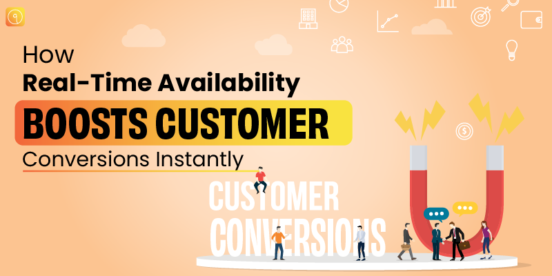
Here’s the fix: real-time availability upfront; no login required.
Just show what slots are open, who’s available, and when. Right on the first screen. Let people explore before they commit.
You’re not giving away sensitive data. You’re giving people what they came for, i.e., fast answers.
This is one of those mobile service app tools that gets users to stick around. Because if your app respects their time, they’re more likely to book.
Why it matters:
Time-sensitive bookings happen all the time, same-day grooming, urgent repairs, and spontaneous self-care. If your app hides the one thing users are looking for, you’re instructing them to go elsewhere.
How it improves UX and retention:
Instant visibility builds confidence. Even if they don’t book today, they remember that your app made it easy to check. That’s how casual users turn into repeat customers.
Where it fits:
The main screen or service selection page should always include a preview of open slots. Use location to filter nearby providers and real-time updates to avoid double bookings. Just don’t ask for a login until it’s actually needed, like payment or confirmation.
This is one of the most overlooked service app tools out there. But for the user? It’s make or break.
Your user finally found the right service, right provider, right time on your app.
But the slot’s gone.
What now? Most apps just show “Unavailable” and move on.
But here’s the better way: let users join a waitlist. And if that time opens up? Ping them automatically.
It’s one of those must-have service mobile app features that feels obvious once you’ve used it.
Why it matters:
People hate missing out. But they hate having to constantly check back even more. A smart waitlist solves both problems: it keeps your user hopeful and keeps your app relevant in the background.
The user stays engaged without having to do anything.
How it improves UX and retention:
No more refreshing the app to check for cancellations. No more switching providers just because one was booked solid. You keep the user connected to their first choice, and make your system look smart in the process.
Also, you reduce the number of people who give up entirely.
Where it fits:
Right under the “Time Unavailable” message, add a quick “Join Waitlist” option. Let users choose if they want SMS, email, or push notification. Bonus: if they booked with you before, pre-fill their contact info.
This is one of those overlooked service app tools that adds serious value with very little friction. It makes your app feel alive, like it’s working for the user, even when they’re not looking.
For repeat-use service apps, this isn’t a nice-to-have. It’s essential.
Some people want the water hot. Others want it lukewarm. One customer likes their lawn mowed diagonally. Another always wants their hair parted left.
If your app doesn’t remember these things, you’re asking users to repeat themselves every single time.
Notes and preferences should stick. Per user. Per service.
Let users type a quick instruction during booking and keep it tied to their profile. Next time, autofill it. Done.
Why it matters:
People value consistency. And they notice when you remember the small stuff. When their cleaner shows up already knowing “no shoes inside,” that’s a win.
It’s not about being fancy. It’s about showing you care.
How it improves UX and retention:
It removes friction. Repeating yourself gets old fast. But when an app recalls what matters to you, you start trusting it more. That trust builds loyalty.
This is one of the best mobile app features for service apps that turns casual users into regulars.
Where it fits:
During booking, add a “Special Notes” or “Service Preferences” box. Save those notes to the user profile. When the same service is booked again, pre-fill it with a quick edit option.
This small feature creates a better experience for users and helps providers deliver exactly what’s expected.
A user wants a haircut and a shave. Or a home cleaning and a carpet deep clean. But your app only lets them book one thing at a time.
That’s a headache.
Multiservice booking solves this. Let users add multiple services to a single booking, even if they require different providers or time slots.
Why it matters:
Users want flexibility. If they’re already using your app, don’t make them finish one booking just to start another. That’s a fast way to lose their interest.
This is especially important for apps offering booking app functionality across categories.
How it improves UX and retention:
Bundled booking means fewer drop-offs. It respects the user’s time and increases the total value of every transaction. More services per session = more revenue and higher satisfaction.
Where it fits:
Start by adding an “Add Another Service” button during booking. Auto-suggest related services. Show availability in parallel, so users can confirm everything in one go.
It’s one of those mobile service app tools that feels small but delivers big.
The user books a service, which can be either a massage, a repair, or a haircut.
Then they forget. So what’s next? Solution: Add-to-calendar integration
Such integration may sound boring, but it prevents no-shows, boosts attendance, and makes your app feel smarter. And when done right, it’s a single tap.
Why it matters:
People use multiple calendars, Google, Outlook, and Apple. If your app doesn’t offer a quick “Save to Calendar” prompt, they’ll either forget the booking or scramble to add it later, and both are unnecessary pain points.
How it improves UX and retention:
Reminders keep people accountable. When your service gets added to their daily schedule, it becomes part of their routine. And that’s exactly what sticky apps do, they become habits.
It’s also one of the most low-effort, overlooked service app tools to implement.
Where it fits:
Right after the booking confirmation screen. Drop in an “Add to My Calendar” button with options for Google, Apple, and others. Let users choose, don’t assume.
This feature won’t blow minds, but it will reduce no-shows. And that matters for everyone involved.
Users love to bookmark what works.
Let them favorite providers, locations, or even full-service combos. But go one step further, let them add custom tags. Things like “Fastest haircuts,” “Pet-friendly cleaner,” or “Sunday-only guy.”
It’s their shorthand. Give them a place to save it.
Why it matters:
Everyone wants to save time. If they’ve had a great experience, they want to lock it in for next time. And not everyone remembers names or service types. Tags solve that.
It’s a feature that makes service app user features feel personal.
How it improves UX and retention:
Favorites cut down on decision fatigue. And custom tags give people a way to organize their app in a way that actually makes sense to them.
It’s also a subtle push toward rebooking. The more users interact with their Favorites list, the more likely they are to book again.
Where it fits:
After a successful booking, offer a quick “Save as Favorite” option. Let users name it or tag it. Also, add a “Favorites” tab on the home screen for easy access.
This is one of the must-have service mobile app features that makes your app feel like it belongs to the user, not just another tool.
The big headline hasn’t changed: most users disappear fast. Business of Apps tracked thousands of launches and found that 77 percent of new users bail within three days of install.
Month-one churn still hovers around 55 percent. A separate 2025 review of 50,000 apps shows 71% are gone by day 90. Those numbers make one thing clear: retention isn’t about getting downloaded; it’s about giving people reasons to stay.
When Travel Tech Labs simplified its reservation flow, adding quick re-book and auto-prefill, the brand logged a 30 percent jump in completed bookings. Users weren’t dazzled by a redesign; they just loved a faster path to “Done.”
That mirrors what Google Play’s 2025 trend sheet shows: apps that surface key actions in one or two taps record 35 percent better week-one retention. In other words, the “small” touches we call overlooked service app tools are doing the heavy lifting.
App-store reviews mined by UXCam in late 2024 found that the most common one-star reason was “Can’t see availability without logging in.”
Real-time slot visibility, a classic must-have service app feature, cuts early drop-off by up to 18 percent for booking apps because people decide faster when they see open times first. That’s a lift no loyalty program can match this early in the journey.
Google Play analytics from May 2025 show services that add automated waitlist notifications reclaim 12–15 percent of users who would have left for a competitor.
A short nudge that says, “A spot just opened, want it?” turns near-misses into revenue and nudges retention metrics upward with almost zero marketing spend.
Personal-note storage, saving haircut preferences, appliance model numbers, pet instructions, sounds minor, yet a 2025 survey of 4,200 utility and home-services users found 56 percent were “much more likely” to rebook when the app remembered last-time notes automatically.
Those saved snippets fall squarely under service app user features that feel human, not technical.
Fremont-based Home Hub A/B-tested single-service checkout against a multiservice cart. The bundled flow (cleaning + carpet deep clean in one go) raised average order value by 28 percent and cut checkout time by 32 percent. Users didn’t ask for a new banner or badge; they wanted fewer screens.
No-show rates hurt both sides. A 2025 hospitality-app study showed that adding a single-tap “Add to Calendar” button trimmed missed appointments by 22 percent, especially for same-day bookings. For a business, that’s pure margin saved; for the user, it’s one less thing to remember.
Apps that let customers favorite a provider and tag them (“Sunday-only barber”) see repeat bookings rise by 17 percent over six months, according to mid-2025 figures from WDP Technologies’ retention tracker. It’s the simplest form of personalization—yet it outperforms far bigger loyalty schemes.
Stack these tiny shifts, guest mode, quick re-book, waitlist pings, stored notes, and the numbers move. Internal dashboards from three service apps reviewed in Q2 2025 show a combined 25–35 percent jump in day-30 retention once at least five “micro” upgrades are launched together.
Users stayed because the flow felt built for them, not for funnel metrics.
Bottom line: the data keeps pointing to the same truth. People don’t come back for feature lists; they come back for ease.
Nail these best features for service apps, the light touches often skipped in sprint planning, and you turn first-time downloaders into steady, paying customers. Small isn’t small when it keeps the app on the home screen.
It's not always what users say, it's what they don't. Because if you ask users what they need from a booking app, they'll tell you the obvious: fast, easy, bug-free.
But if you tap into how they use your app, the real tale emerges.
What gets you isn't always deafening. More often than not, it's the little things that go unnoticed, until your users quietly leave.
So let's discuss catching those cues before they slip away from you.
Most brands obsess over conversions and drop-off points. Fair. But real user insight lives between the clicks. Let’s say your analytics show a healthy completion rate for your booking app, “great”.
But if users are bouncing after reaching the “Select Add-ons” step or backing out when asked to sign in again. You’ve got clues.
These aren’t bugs. They’re user experience cracks. The kind that makes people say, “Ugh, I’ll do this later,” and then never come back.
Track where people hesitate, where they double-tap, scroll back, or rage-quit. That’s where your app can improve.
User reviews are gold, but too often, teams skim them looking for praise or glaring issues. Don’t do that.
What you want are patterns. If several users say, “I wish it remembered my last booking,” that's a disguised feature request. If a user says, “Took me three screens just to book a haircut,” you're being informed that your booking app functionality needs to get simpler.
Ditch vanity metrics. Pay attention to echoed phrases. That's your roadmap.
Nothing takes the place of seeing someone who actually uses your app.
You don't need a formal test group of 50. Just 3 or 4 users, screen recording themselves using your app in the course of their everyday life, will reveal more insights than months of internal speculation.
You'll see where they get stuck. Where they tap the wrong button. Where they assume something should work differently. That's the stuff you can't learn from data alone, and it's exactly where your must-have service app features should be focused.
One of the easiest traps to fall into? Building for the team, not the user.
Developers and stakeholders can believe a feature makes sense, but if it's hidden in a submenu or named in such a way as to be confusing to new users, it doesn't count. A feature people can't discover may as well not be there.
Step out of your own head. Allow real user behavior to influence design. That's how the greatest mobile app features for service apps are born.
It's easy to quit monitoring after someone schedules a service. But what they do thereafter is equally telling.
Do they launch the app again to reschedule? Do they attempt to add it to their calendar and abandon it? Are they looking for a means to save an admired provider or repeat a service?
These are gentle yet influential behaviors and where neglected service app tools can convert casual users into loyal ones.
Users won't write reviews stating, “Wow, love how this app remembers my last appointment time.” But take that away? They'll notice. And they may stop using your app altogether.
Saving user preferences. Auto-sending reminders. Providing a waitlist when time slots fill up. These aren't extras; these are 2025 standards.
Smart brands understand that careful, human touches make apps that users come back to. It's not flash. It's flow.
So what's the lesson here? You don't have to completely overhaul to build a better experience. You just have to observe, listen, and build with empathy.
And sometimes the greatest mobile app features are the ones nobody discusses, because they're so good, no one even notices.
The distinction between a forgettable and a sticky app commonly revolves around the little decisions early on, the kind that seem insignificant until your consumers either love your product or ghost it.
So if you're designing a professional service management app, here's the truth: don't follow trends. Prioritize usefulness. Your users don't need more features; they need improved ones.
Let's go through how to do it.
But before you draft a line of code, speak with five possible users. Then five more. Not founders, not designers, but the real people who would possibly use your app to schedule a cleaner, a haircut, or a massage.
Discuss what they like. What they dislike. What they wish their existing app did more of.
Then go read 100 app store reviews for both popular and niche booking apps. Patterns will emerge fast. You’ll see exactly which user-focused features in apps get loved and which ones spark frustration.
This is your starting point. Not guesswork.
Rather than scaling up a complete product and praying it sticks, identify one or two mobile service app tools, such as a more intelligent rebooking flow or a live availability preview, and experiment on real users.
Employ click dummies. Employ screen recordings. Provide mock bookings for users to fill out and observe where they stumble.
That uncomfortable hesitation before clicking? That's design debt. Fix it now, not after launch.
Once you’ve launched, you’re not done. Not even close.
Add quick feedback prompts in key flows. Run A/B tests on different button placements. Try slightly different versions of your booking app functionality and measure what feels smoother to users.
Sometimes a simple tweak, like pre-filling last-used service providers, can improve retention more than launching a whole new module.
The less repetition your users have to do, the happier they'll be with your app.
If someone orders the same service weekly, enable rebooking in one tap. Save preferences, staff favorites, and notes; these small automations are the type of service app user features that go unnoticed. Until they're removed.
Your app may functionally “work,” but if it's clunky, users will bounce.
A booking app can have all the features in the world, but if changing between steps is baffling, or if the confirmation is a dead end, that functionality doesn't work. Smooth transitions are important. A seamless handoff between screens can mean more for loyalty than a complete loyalty program.
Open AiOiA and the first thing you notice is speed. No deep menu maze. No guessing which tab does what. The app shows nearby services, gyms, plumbers, and nail salons, right on the home screen.
Each card shows real-time slots, prices, and quick “Book” buttons. Tap once, lock it in, done. But the app isn’t just fast; it remembers you.
Love 7 a.m. workouts? AiOiA slides those classes to the top next time. Need a stylist who handles curly hair? Mark them as a favorite. These tiny personal touches come from simple, thoughtful mobile app features the team keeps tweaking.
AiOiA is a service management app at its core, so the same attention goes to the provider side. Local businesses get a clutter-free dashboard to list open times, manage waitlists, and answer quick messages. No rocket science expertise required.
Just clear controls that work on the first try. Happy businesses mean more options for users; everyone wins.
Missing information? You can chat with a provider inside the app. No outside emails, no missed DMs. Need to reshuffle an appointment? Two taps and a new slot appears. These are the small things that most booking apps skip, yet they cut frustration for both sides.
AiOiA even handles payment preferences. Want to keep a card on file? Cool. Prefer cash later? Also fine. The goal is choice, not hoops.
And yes, there’s a waitlist. Join it, forget it, and get a ping if a spot opens. The app keeps working while you move on with your day.
For businesses, listing on AiOiA brings targeted eyes without huge ad budgets. You appear in front of locals who are ready to spend now, not next month. Set up once, update hours on the fly, watch bookings roll in.
All of these run on iOS and Android, so no one misses out.
AiOiA isn’t trying to wow you with buzzwords. It just clears out the noise, connects people, and lets service pros focus on what they do best.
That’s the kind of service management users remember and the reason they keep the app on the first screen of their phones.
Big releases grab the spotlight, but little touches keep the lights on. A single-tap rebook, a waitlist ping, a note that “Bruno the labradoodle is scared of vacuums.” These details feel humble. They’re not. They’re the glue that holds users in place.
Every time your app remembers something for a customer, it saves them from repeating work. That relief becomes trust. Trust becomes a habit. Habit is retention. Simple chain, no magic needed.
The takeaway is clear: you don’t need an endless roadmap. You require a sharp eye for friction and the will to shave it off piece by piece. Guest access, calendar sync, and real-time slots are mobile service app tools that ask for hours of dev time, not quarters. Yet they outperform splashy redesigns because they respect people’s time.
So look at your backlog. Circle the quick wins that remove taps, cut waiting, or spare users from retyping the obvious. Ship those. Then watch the numbers steady, the reviews soften, and the uninstallation rate edge downward.
Small lands first. Small sticks around. That’s the whole playbook.
Features such as guest mode access, real-time availability without logging in, and personal service notes are usually overlooked during development, but users adore them. These overlooked service app tools contribute to friction reduction and trust building, which results in improved retention.
Because customers frequently wish to book multiple things at the same time. Introducing multiservice booking streamlines the process and enhances convenience—making it a top booking app feature that raises satisfaction and order value.
Features such as waitlist reminders, calendar integration, and favorites with individual personal tags ease daily interactions. These subtle mobile app features silently lower no-shows, foster user loyalty, and keep users returning again and again.
In 2025, the most important features for service apps are the ones that value users' time: quick bookings, customized experiences, saved preferences, and adaptability. The more your app accommodates the user, the longer it's going to keep them around.
Smart service management apps provide businesses with tools to manage bookings, availability, and customer relationships with little additional effort. It places them in front of the correct users, those already looking for services in their area.
Allowing users to save preferences or rebook services in a single tap is an easy yet essential service app feature. It makes the app quick, comforting, and useful, three ingredients that have a strong bearing on long-term retention.


.png)

AiOiA is the ultimate appointment booking system, offering seamless scheduling and effortless table reservations to enhance your business efficiency.